Sunburst Chart In Excel
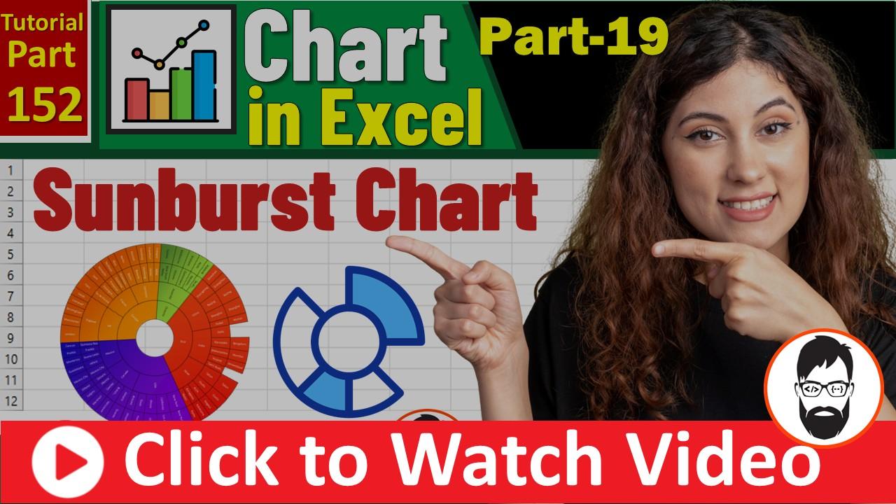
Excel Sunburst Chart Tutorial 💡 | कब और कैसे Use करें? | Full Guide | Excel Tutorial
Excel Sunburst Chart Tutorial 💡 | कब और कैसे Use करें? | Full Guide | …
Excel Sunburst Chart Tutorial 💡 | कब और कैसे Use करें? | Full Guide | …

Master the Treemap: Learn to visualize complex hierarchies and nested data structures in Microsoft Excel …

फाइल डाउनलोड करें? Download Excel for Practice ———–🔵 MS Word Tutorial Playlist http://bit.ly/MsWord-Tutorial————-🟢 Tally Tutorial …

PDF फाइल डाउनलोड करें? Download Excel for Practice ———–🔵 MS Word Tutorial Playlist http://bit.ly/MsWord-Tutorial————-🟢 Tally …
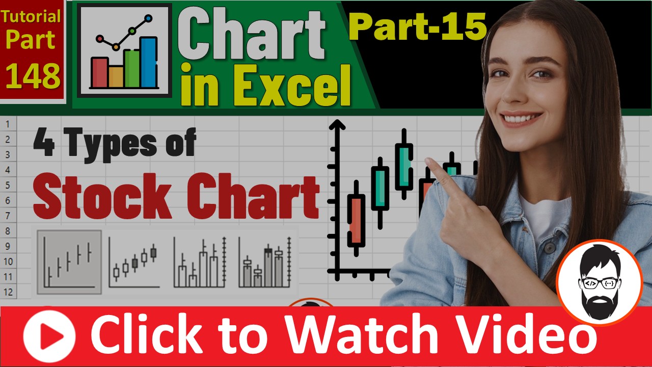
Excel Stock Chart Tutorial | All Type: High-Low-Close, Open-High-Low-Close, Volume फाइल डाउनलोड करें? Download Excel …
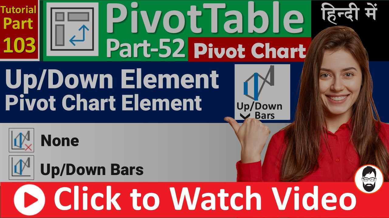
MS-EXCEL-103-Up-Down Bars in Pivot Chart – How to change width of Up-Down Bars – Free …
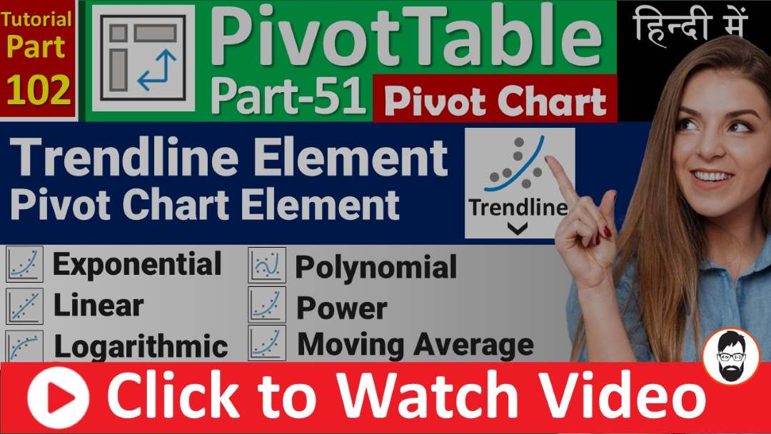
MS-EXCEL-102-Trendline Element in Pivot Chart | Types of Trendline | Moving Average for Stock Chart …

OLAP Tools menu in PivotTable. “Offline OLAP…” option, this feature allows you to work with data from an Online Analytical Processing (OLAP) cube even when you are disconnected from the server

Unlock the full potential of Pivot Tables with our latest tutorial on Calculated Items

Discover the power of Calculated Fields in Pivot Tables and unlock advanced data analysis capabilities. Learn step-by-step how to create and utilize Calculated Fields to perform custom calculations, derive insights, and enhance your data visualization in Pivot Tables.